Look / Feel
- Colors
- Type faces
 |
 |
Info Arch
- Layout
- Design
- Navigation
Content
- specific modules
- placement / priority / emphasis
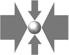
It’s difficult to process all of these at once; you can run the danger of allowing shortcomings in one area overshadow Good Things in other areas.
While the end-product – the Designed Page – needs also to be reviewed as a whole, it can make good sense to break out these items individually and rate the works by them.
This should help with internal review processes and discussions as well as feedback for vendor partners doing IA and Design with you.


